

Still musing on wall color
The color saga continues, with no progress but lots of reader suggestions and various inspiration since my first attempt at choosing colors for my new stucco walls. (Click and read the comments on that post if you’re into color discussion!) My first stab at a red was too McDonald’s-ish, as one reader aptly described it, even for red-loving me, although some readers gave it a thumbs-up.
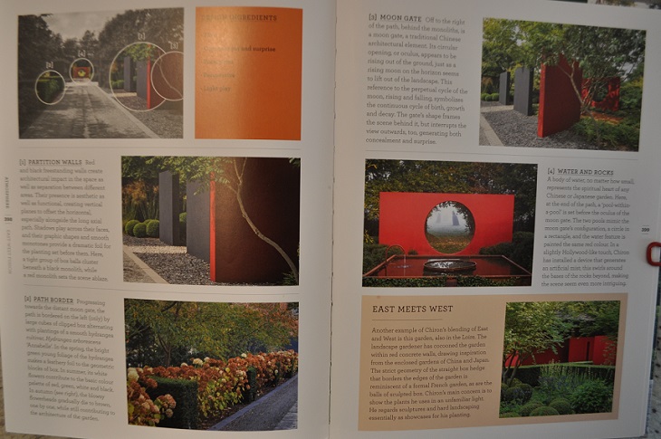
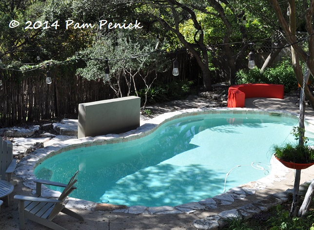
I’d just about decided instead on a terracotta-orange (not too soft because I still crave color!) for the curved walls when I encountered this two-page spread about a garden in France, from a book I’m currently reading and highly recommend, Gardens in Detail by Emma Reuss (which I will be reviewing just after Thanksgiving, so stayed tuned). Check out those red and charcoal walls! And by the way, this excerpt gave me a name for my central, rectangular wall: a monolith. How very 2001: A Space Odyssey.
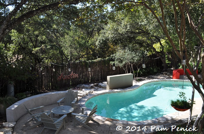
The red in the book is not too different from my curved-wall red, is it? But I do have the turquoise pool to consider, which plays a big color role in my garden already. So I’m still pondering. I definitely want two colors, one for the curved walls and one for the monolith. The existing colors in my garden furniture, art, and painted surfaces are cobalt, turquoise, red, and gray-green, with a few pops of pale yellow. Foliage color tends toward olive and blue-green, with some yellow variegation. Flower color is negligible but mostly orange or hot-pink.
Like this. In fact, see this post to see the colors I love to use. You’ll notice my blog design is built around these colors too.
Feel free to opine on wall colors in the comments section. I won’t be painting again until February because of a big project I’m working on. More about that soon too!
All material © 2006-2014 by Pam Penick for Digging. Unauthorized reproduction prohibited.
I REALLY like that dark charcoal color but would it get too hot-feeling in the summertime? How about more of a coral color for the curved walls? Or something completely different – lime green? I also think plum would look nice.Your oxalis inspired that thought.
Someone on the last post was urging me to consider purple, and I was resisting. But it does look awfully nice with the turquoise pot, doesn’t it? I don’t know that lime green will work with the grey-green of the Adirondacks, which is why I was leaning to the red family. —Pam
What a decision! Turquoise and coral (or terracotta) play off each other beautifully. I think the turquoise pool against the red is jarring to your eye and coral would be more pleasing. You need somebody to photoshop those colors onto your picture and play with it! Love those walls and the monolith!
I hadn’t thought about coral, although I do like the idea of terracotta-orange. Coral might be nice though. —Pam
My vote is for the terracotta orange.
My daughter is rooting for that too, Nell Jean. —Pam
I was looking at the red in the book spread and then at the red wall in your photo and thinking, “but it’s her pool that makes the red not right”…and then I paged down and read that you felt the same way!
I love the grounding look of the charcoal in the spread and do think it would look great on your monolith. I feel since it’s the straight wall-like structure it needs to be darker than the curves. If not charcoal then maybe a dark blue. For the curves I think I would go with yellow, maybe a red yellow. That way it will play nice with your Austin sign and other red/orange touches. A lime green could be fun, but that’s more me than you.
Now I’m remembering your garden shed, isn’t it charcoal? Maybe just a dark grey? Might the color on it work on the monolith?
Thanks for your thoughts, Loree the Color Goddess. I actually tried to replicate the shed color (a medium gray-green) when I painted the monolith, but as you can see, it looks almost as if it isn’t painted at all. So I was definitely thinking along those lines myself, but now I’m leaning toward dark sapphire/cobalt for the middle wall. I agree that the light-blue pool is throwing off the red. I’m resisting yellow on the curved walls, but I do like the idea of a gentle orange. Or maybe Jean will sway me to the plum. —Pam
When we had to paint the exterior of our old house, I had a lot of difficulty making the decision because, once it was painted, there was no going back. Also, the paint color seemed different on the swatch than what it looked like on the back of my house in the sun.
Here’s what I suggest: Buy many small sample jars of paint in the colors you like and try them all on your wall. The samples are cheap. Even if the samples are only available for interior paint, it’s the color you are after. Once you decide what you like then buy that color in exterior grade paint.
It took me 13 colors painted on the back of our house to make the decision.
Laura, I’ve always heard that advice too. But recently I read that putting lots of low-quality (possibly indoor) sample paint on your surface can adversely affect your final coat. Maybe a better solution would be to paint poster board with the samples and tape it to the surface to be painted. It wouldn’t be the same texture but better than nothing? —Pam
I’m with Laura. It’s a big decision and color is a very personal thing. I’d buy a lot of small cans and do some test patches. Noting the concern you expressed above, perhaps the paint store experts can provide guidance. (John Gidding on Curb Appeal always slapped a lot of colors on his clients’ walls but I admit it would make me nervous too.) Maybe all you’d need to cover an unacceptable paint choice would be a primer.
I’m going to try to narrow it down with the help of Photoshop first. I may end up having to custom-blend to get the color I want. —Pam
OK…so I’ve forgotten one thing. What type of paint is recommended for a project like this? I know there are a lot of concrete paints out there now.
Dunn-Edwards was recommended to me by two designers in Arizona who have built stucco walls. Luckily Tree House carries it here in Austin. —Pam
Think of a turquoise and coral necklace…they work, right? I still like the red 😉
Yes, indeed! —Pam
It looked like one of those walls in the photo spread had charcoal on the broad sides and red on the narrow sides. I like the way those accentuated edges looked a lot. For me it made them even more architectural, for lack of a better term.
So perhaps you use your curved wall color to paint the narrow edge of your monolith. Or use another accent color altogether. Using that smaller contained space within the larger context of painted walls could give you a reasonable way to easily change up your look.
Have you seen the walls at Peckerwood, Deb? Owner John Fairey painted the edges and tops different colors. It’s an interesting idea! —Pam
Oooops. Went back for another look and the walls were adjacent. I stand by my suggestion however. Edges are everything.
Farrow and Ball’s Charlotte’s Locks is a very nice coral/orange. More orange than coral. My outdoor dining chairs are powdered coat in Charlotte’s Locks. I use foam core for sampling paint. Hobby Lobby sells in some large sizes. Perfect for sampling colors without having to live with all the test colors…Charles
Thanks for the color suggestion, Agavetx. I think that might be a little hotter than I’m looking for, but it’s a gorgeous color. Foam core is a great idea — thanks for that too. —Pam
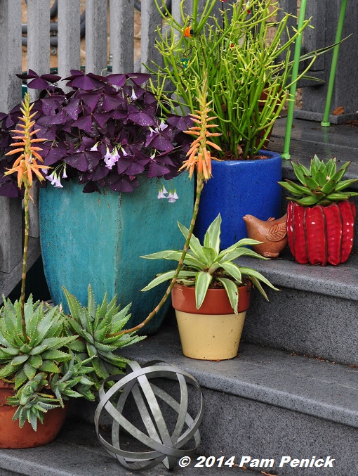
The color of the little pot on the top step in your last picture would play well with charcoal and turquoise.
That’s pretty much the color on the wall right now, Debi. I thought it would be perfect too, but, well, it just seems a bit bright/hot. Hey, did you notice that little pot has charcoal ridges? Looks great with the red! —Pam
If you go for a red, make it a blue-red, not the orangey red of the McColor theme you currently have (I say this jokingly)…This red will coordinate better with your turquoise pool. But orange, in a terra cotta tone would be gorgeous, and cobalt blue would also be great and cooler visually – if that’s the vibe you are going for. But I agree, get lots of samples and play with it – it’s only paint and can easily be changed. Have fun!
I already am, Tamara! Thanks for the suggestions. You are so good with color in your own garden! —Pam
I’m looking at the picture of the Agave with the dark black-ish thorns on your sidebar that says “feel like sharing?” The Agave leaves are turquoise (like the pool)… what if your curved walls are dark black/charcoal with a bit of eggplant/aubergine (like the thorns) and the center wall could be another color you see along the edge of the thorn… I see golden yellow… with tones of aqua, blue and ultramarine, and sage in the leaf margin. Not red, I know, but I love to pull colors from ones favorite plants in the landscape! Fun project Pam, we look forward to seeing what you choose!
Ooh, that would be a dramatic, mod color scheme — kind of like JJ De Sousa’s a little, yes? —Pam
Established: the largest block of color that you have and can’t ignore is your pool – turquoise, so it makes sense that you have to start from there. I’m voting with Jean. In looking at the pots arrangement, I’m seeing that turquoise pot with the plum oxalis – dynamite. Then the succulent blooms adjacent, the luscious coral. So, plum for the monolith, coral-tone terracotta for the curved walls does it for me. The grey-green of chairs and table are neutral; they’ll go with anything you choose.
It will be fascinating to see your final decision.
Yes, establishing the pool as the base color has been helpful to me. I ignored it in round one, and that was a mistake. Well, that plus I just really wanted red walls — ha! Thanks for your suggestions, Sandy. —Pam
I am liking the red wall better now that I am seeing it in your recent Fall pics. I love the bright color of your cobalt blue pot, so I am suggesting that for your ‘monolith’ and the orangy yellow color to match the California poppies in the LawnReform.org picture for the other curved wall. I am looking forward to the colors you finally choose in February. Your pictures make me very happy! – Terry
Thanks, Terry! I’ll keep you updated! —Pam