

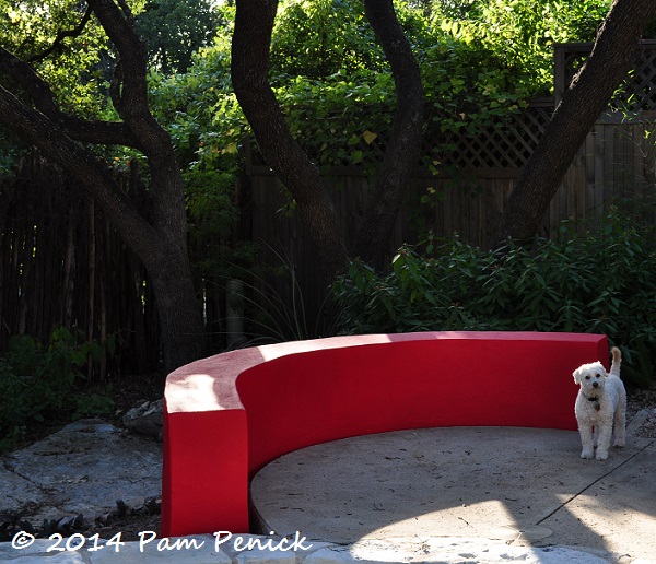
Blazing red wall
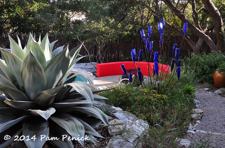
I threw a coat of paint on two of my new stucco walls before the cold blew in on Tuesday, and holy smokes — the Dunn-Edwards ‘Hot Jazz’ red on the curved wall sizzles my eyeballs. It definitely picks up every bit of red in my garden, from salvia blossoms to my red Circle Pot to the Austin sign on the back fence to the umbrella on the deck. Am I this bold?
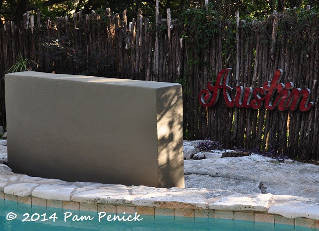
Maybe a warm pumpkin/terracotta would be better to tie in with the tiles along the rim of the pool (see next picture). I don’t want to end up with UT burnt-orange walls though, even if I do live in Austin.
On the taller, middle wall I’m trying out a khaki green. I originally planned to paint the tall wall the bolder color and the curved walls khaki-green. But because my Adirondacks by the other curved wall are a gray-green, I realized I needed a contrast, plus I wanted more color. If I paint the curved walls terracotta, maybe the middle wall should go blue-gray to play off the pool tiles? Any Dunn-Edwards color experts out there?
Decisions, decisions. Also, am I the only person who has to see something fully painted before knowing if it’s right or wrong?
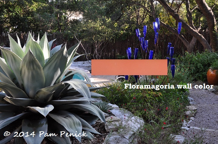
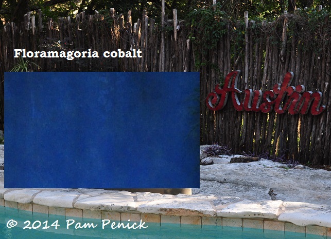
Update: I’m imagining a warm terracotta for the curved wall and cobalt for the taller wall, inspired by Floramagoria in Portland. Their light is very different from our light, and I suspect the deep blue would fade under the Death Star. Still, it might work. What do you think?
UPDATE 11/17/14: I’ve got a new post up about choosing colors for my walls; click through if you’re interested.
All material © 2006-2014 by Pam Penick for Digging. Unauthorized reproduction prohibited.
Nice thing about it is that if you tire of one color you can always change it.
Very true. Though I’m likely to change it several times up front. —Pam
I dunno. It might be like a new garden, live with it for awhile and see where it takes you?
(Obviously I like the red!)
POPPIN’!!!!!!!!!!!
LOOOoooooove! Good Choice, Pam!
It’s hot fun, Heather. 🙂 —Pam
I agree with Cheryl…paint is forgiving. You can always change it.
Live with it a while. It might grow on you.
Paint is easily changeable but not as cheap as everyone makes you believe. These cans of Dunn-Edwards stucco-friendly paint were more than $30 each at TreeHouse in Austin. I’m likely to buy several more cans before it’s all said and done. Sigh. —Pam
I typically accept color choices and eventually see whatever “is” as what “should be” after I’ve lived with it for a while. We have a lot of color in our house but I think once you get away from white walls you never really want to go back. I do like seeing a color as a test patch before choosing but honestly I usually throw caution to the winds, choose and PAINT!
I love the red – if you feel it is grabbing too much eye time maybe you could swap for a slightly cooler version? One with a little more blue in it? Or how about my original suggestion of purple? I maintain that wall is absolutely crying to be P U R P L E…!
The khaki where it is works so well with the “Austin” sign…
I know just what you mean about avoiding burnt orange in Austin. We’ve already got plenty of that in these parts. If you want a different direction to go then, aqua? Turquoise? This is fun!
I totally agree that once you paint white walls you’ll never go back. Color is too much fun! I do love purple, but I just can’t see it in this garden, not with all the other colors already there: cobalt pots and bottle tree, turquoise seat cushions and shed door, red umbrella and accents, and gray-green shed siding. I don’t want a traditional desert-southwest palette either, so I’m steering clear of peach, yellow, and turquoise on the walls. And no burnt orange! Maybe the red will work out after all. —Pam
It’s hard for me to know what will work just by looking at a little color swatch or even a test patch. I love the red! I would paint them all a bright color, red or orange or deep purple or electric blue. That tall wall in red would really pick up the Austin sign.
I’ve considered painting them all the same color, Alison. It might make things easier. —Pam
The red is perfect. The orange tones start turning to peach (ugh).
No peach, I agree. But what about a warm terracotta like in Floramagoria garden (first 3 pictures)? —Pam
I vote for more of an orange color. I think it would better with the blue bottles. And, no you’re certainly not the only one who needs to paint the whole thing until you know for sure! Painted my bedroom three times in a row.
A kindred spirit! You wouldn’t believe how many times I painted my front door recently, Amy. —Pam
I absolutely LOVE the red!!
A red lover! I love red too, Judy. Man, this is a hard decision. —Pam
I love the red. It does seem kinda HOT for you, but then again, I’ve just been thinking about how much red you like in your garden. Maybe it’s the khaki color that’s not working with it. I’d live with it for just a little while if you are unsure. If you hate it, hold you nose and go back to Tree House.
I’m sure I’ll be back many times! They’ve actually been very helpful to me in figuring out the best paint and primer for stucco. —Pam
I love the pop of color! How fun, especially as we go into the winter months. I’d live with it for a while if it were my decision but on first impression I think I’d try a warm terracotta for grins. Can’t wait to see this in person!
With this early cold weather it may be a while before I get a chance to paint again. I think living with it for a while is my only option, especially since I’m awaiting small repairs on my other wall. —Pam
I love the orange in the garden you linked to. The red feels too commercial/restaurant or school house to me. Would it be less expensive than paint to try out new colors by placing poster boards in the colors you are considering in front of the walls until you can make a decision? Also, what color are you sticking with for your front door? Maybe, that color could carry through to your backyard from the front.
Do you mean buy sample pots and paint poster boards with them? That’s not a bad idea, although I’m really terrible about knowing if a color is right without having paint on the whole thing. The front door is turquoise, but I don’t want to use that on the walls. —Pam
I say live with it for a bit. It is bold but with all your spikey plants I think this is great. Maybe put a big red strip on one of those duller wall or a big polka dot or two. 🙂
It’ll definitely remain bold, Lisa. I love bold color, and adding color is half the reason I put these walls in. I think I’ll skip the polka dots though! 😉 —Pam
I like the red, but I think I’d LOVE the warm terracotta. By the way, I’d be reluctant to admit how many times I’ve painted things over,and over, and over! Oh well … 🙂
You just can’t tell about a color until something’s fully painted, or at least that’s what I always say. —Pam
Pam I think the reason you aren’t loving the red is because the base color is wrong,you need a blue based red to have it look right with what you already have going on. I personally think a dark teal,and charcoal on the others with pops of blue pots. It will look amazing with your plantings.
Glenda, I do like cool reds, but I went with a warm base because of the limestone coping and tiles around the rim of the pool (last picture), both of which contain warm, rusty-orange tones (there is also pale aqua in the tiles). And while staring at the unpainted gray walls for weeks, I realized that they stood out well against the dark cedar fence in the background, so I decided to stay away from dark colors. Otherwise I agree that a greenish charcoal (I have a similar color around my front door) would look great. Experimentation continues! —Pam
Forgot also I would buy small samples of any cheap paint and paint cardboard panels and sit them in front of your new walls to see the new choices. Might need to throw a sheet over the red wall to actually see your samples better.
Maybe wait for a totally cloudy day before making changes, but a less blue red with a bit more depth may work better. The value of the terracotta shown in your other post speaks so well in its surroundings. Being warm, it advances but with a rich subtlety.
Using a lot of color, but find I generally don’t need to patch paint. Some clients prefer it, though. Seeing colors from chips and swatches is something we can develop a sense for over time. As designers, we can can order full sheet swatches from Dunn Edwards. Place them on surfaces to be painted. Always carry them outside to see at different times of day, especially early or late. Playing with the full set of their color swatches in travel case is fun, too. Right now, I am having a love affair with Scarlet Past (DEA150). Will Tweet you an image.
Enjoy seeing your stucco walls experiment. Good luck, and keep us posted!
Ooh, there’s such a thing as full sheet swatches? I look forward to seeing your tweet. We Austinites don’t have a lot of experience with painting walls; it’s almost all stone or wood here. In fact, I felt lucky to find Dunn-Edwards paint here (one supplier across town carries it), which is one of two brands recommended to me by Arizona designers who paint stucco all the time. Thanks for sharing your experience with the brand. —Pam
Hi Pam, here is a link where you can get in touch with a D-E sales rep to order case and swatches: http://www.dunnedwards.com/ArchitectsDesigners/Services/ArchitectDesignerServices.aspx
And, Austin is lovely with all its stone and wood. Los Angeles must be the stuccoed suburbia capital of the world!
Nice, Pam! You’ve been channeling Ricardo Legorreta and Steve Martino. That Hot Jazz red with the blue bottle tree and the plants is smashing! I’d go with that, at least for a while.
I don’t know Legorreta’s work, but I’m definitely feeling the influence of Steve Martino since touring two of his gardens last spring. —Pam
🙂
Wowzer, that’s red alright! I was thinking you were going to go more terracotta but if you are having fun with that blue-red, stay with that. It’s all about what you like after all. And it may take a while for you to make a final decision anyway.
I will say that on my monitor I can’t see a lot of the green in the khaki green color. Looks mostly khaki gray to me. I have also seen the half to full page swatches before. You should definitely order them.
I don’t think either one is going to work, Jean. I have felt wishy-washy about them for 24 hours, and that’s never a good sign for someone who isn’t afraid of color. I’ll have to try out those bigger swatches. —Pam
Show us the shot across the garden that includes both walls? I’d like to see how they interplay.
I didn’t take that shot after I’d painted, Jenn. Another time! —Pam
I’d go with a cobalt pot accent over at the Austin area. I think the wall would be too much blue.
(Ah, permission to voice opinions. Yay!)
Can one have too much blue? 😉 —Pam
Pam, I popped your first picture into photoshop and had fun looking various color choices for you. I picked three colors that seemed especially nice- gold, cobalt and violet, and sent them to you by email, since I assume we can’t post pictures on this format. If you have a photo imaging software product, you might try experimenting for yourself before going thru the bother of actually painting a wall. Sue
Sue, you are a color and Photoshopping goddess! Thanks for sharing your ideas for paint colors! I’m surprisingly into the violet but like them all. I’m sharing them here for others to see. —Pam
i really like the red….but this violet. Swoon
Thanks for sharing the photos! I was too curious.
Hi Pam,
I have no good color advice. I imagine the death star can make some colors look harsh. The Floramagoria color is really fantastic against the cobalt, but I can’t be sure about it’s flow with the red as you are pulling 2 cool tones against a warm tone. Hmmmm. Looks like you got tones of great advice! Cheers from Portland!
The intensity of light definitely makes colors look different than they do in Portland, but I first fell in love with brightly colored walls in blazing Arizona, so I know they’ll work here. Thanks for cheering me on as I struggle through my color choices! —Pam
Pam, this has been so fun reading all of the advise and ideas about your wall color! I especially like the photoshopped color and was drawn to the yellow/gold one. It pops the blue of the bottles and is a happy color. I always try to include something yellow in the garden to contrast with all of the other colors going on. Think about the gold!
Yellow and blue is a classic combo, and I enjoy sunny golds too, Melody. But I’m just not feeling it on the walls, I’m afraid. (I do have a few pale yellow chairs though.) —Pam
I’m not going to read any of the comments because then I probably won’t put my two cents worth in. Do you want to hear it. I think it is too red. However, I do recall in the 70s how I put down bright orange carpet. I cried after it was laid because it looked so harsh. Then I added some bright accents to the wall and even wallpapered one wall in very bright colors. Orange curtains and suddenly I liked it. I did have to add quite a bit more of the orange tones to balance it out. I think I see that with the blue paint. Easier to look at because you have the blue pot. Then again, you know me and my lack of color-just an earth tone girl in the autumn of my life ( at least I am hoping it is still autumn) Maybe soften the color in whichever you choose.
I agree, Jenny — too red. Your comment about the orange carpet made me smile because the house I grew up in, in the 70s, was decorated exactly like that: all orange, gold, avocado green, and rusty red. My bedroom was carpeted orange, and my bedspread, which I loved, was yellow and green. What a fun, happy house it was to grow up in! —Pam
Here’s another thought Pam. As you know our stucco walls have integral color and we needed to paint the tops of the parapets. We tried to match to the wall color. It was impossible even though I took along a sample of the stucco. Paint behaves quite differently and it depends also on horizontal or vertical. It always seems brasher than what you might be matching it too. Therefore it is important to tone it down several shades. to dull it up a little. That way it has color but doesn’t shout.
Yes, good advice, Jenny. I hope you’re able to match your wall color. —Pam
It’s interesting to see all the different opinions so thought I’d chime in. I feel the khaki wall is too dull and the red a little bright. I think the tall wall in cobalt is really fab. Rusty red, deep terracotta, dark turquoise, persimmon or magenta would all play well off the colors you have going on already and with a cobalt wall. Just my two cents, guess our differences add zest to life!
I’m with you, Heidi — the khaki is too dull, plus it doesn’t work with the tile colors in the pool. I love the cobalt too. My daughter is advocating for a terracotta-orange on the curved walls, and she’s promised to do a little Photoshopping for me, so we’ll see. I’m not averse to magenta either! —Pam
I’m a sucker for red, but that does seem a little over the top. The terra cotta color sings to me, and the blue would echo the bottle tree and all the other blue accents you have going.
Love love love the curved wall.
Me too, Ricki, no matter what color it is. I’m feeling the terracotta, maybe a little deeper, and the cobalt. But I’m going to play around with some other colors too. —Pam
Well, my take is this. I love the red in the second picture, where the color is deeper due to the light. In the first picture, I like it, but can see how it would seem too bright and distracting. I would try to get to a deeper shade of red, more like what it is in diffused light. For the tall wall, I’m wondering about a warm terra cotta/pumpkin like you mentioned. I am a fan of muted red and pumpkin together so I think one of each may look quite nice with what I can see of the rest of the garden. Also, may I ask about the walls? They are fabulous! Did you build them yourself or have a contractor do it?
Hmm, muted red and pumpkin together? Interesting! As for the walls, I had them constructed by Corner Stone Construction Services. They hadn’t done many stucco walls, stone being their main trade, but I think they did a nice job, and they were easy to work with. A few divots have appeared in one wall that need patching, but I’m hoping that’s a simple matter. I’ll know how they hold up in a year or so! —Pam
Woo, that is a smokin’ color! I would personally do a deeper red, but as proved by my blog, that’s a color I love 🙂 I love how the red brings out all the red blooms in the rest of the garden! The pumpkin/terra-cotta is nice too. It’s a little harder to see how the tall wall fits in to the larger garden – maybe a lighter blue/gray? At least you can keep repainting it until it works!
And I probably will, Indie. 🙂 Thanks for your thoughts. —Pam
If you have a contractor friend, see if they can get you a discount at the paint store.
I like orange with the blue bottles. blue and red looks too primary. Blue paint is the least color-fast and will fade rapidly…the wall gets no shade? Deep purple also fades, because there is much blue in it. (Dad was a painting contractor is how I know this stuff.) I have a lavender on my tuteurs. I took a ‘Rozanne’ flower to the paint store and had them match the color. That has held up really well. Lavender?
The middle wall gets several hours of full sun; the curved walls are mostly shaded. At my last house, I painted a garden shed a rich purple, and it did fade, but I found it lasted for a couple years before it needed repainting. If I go with deep blue on the middle wall, it would be easy to repaint every couple years as needed. —Pam
pam, whatever colors you choose, make sure that they are either all clean undertones or all dirty undertones. Right now, at least on my monitor, It appears that the khaki is more of a dirty undertone, and the red is a clean undertone. It will never feel right to you if you mix those two things. Perhaps you could get color swatches, and match the colors of your chairs, your pool, your shed, and your focal point art parts and pieces. Then pull together your whole color story by adding in the colors for the walls. It’s easier to do when you’ve got it in smaller swatches altogether.
Thanks for your color expertise, Robin! —Pam
I don’t like the red despite being a fan of red. In the photo it seems to be sucking the light. It seems to be a blue based red, a yellow based red might be more zingy. I was going to suggest an orange, not the terracotta you show but a strong orange. I think orange and the blues you have work very well. However, I also like the violet. I really don’t like the tael green it is far too flat and with the strength of light you have you can go for something much stronger. If it was me I would go orange and maybe violet
My daughter is rooting very hard for an orange/terracotta, so that’ll probably be my next attempt. If she’s right, I’ll never hear the end of “I told you so!” 🙂 —Pam
RED!!!
There’s nothing like red for zing, is there? —Pam
Wow, red get’s everybody’s attention doesn’t it! I love the reds and red oranges, and I have a burning desire to add some salvia Darcyi when I can find them to buy, but I’m with the group that thinks this red makes every photo all about the wall.
I referred my urban nature group to your blog in a spirited discussion of the High Line garden yesterday, led by Kevin Anderson, geographer, philosopher, naturalist extraordinaire.
Thanks, Tom! I hope they enjoy my High Line posts. —Pam
Pam I should mention again my attraction to your big orange pot over the years, so big-pot orange on the wall would probably make a nice garden view.
Big-pot orange — that should really be a paint color. —Pam
Pam, LOVE the RED!!! and the Floramagoria Cobalt!
Lots of red lovers out there! —Pam
Pam, I love the violet, but then I love purples! Also, the blue is stellar; and like others have said, the original red is the wrong red. I could easily fall for the terra cotta once you paint it! Thanks for sharing! REally, have loved the contributions and comments
Isn’t this fun, Gail? A lot more fun than slapping another coat on those walls, at least for now. 😉 —Pam
OK…throwing in my 2 cents worth. I like the yellow and the cobalt that one of your fans Photoshopped. I also love the Flormagora ?? orangey color. The red is a little bright and the khaki is too khaki. Olive maybe…
So many great colors, Chris. It’s going to be hard to choose. —Pam
Nope. I looked at those other color “swatches” and I still like the red the bestest.
Lots of red lovers here. Kindred spirits! —Pam
I love it!
Thanks, Phillip. Your purple wall was one of my earliest inspirations. —Pam
Nice! The red is perfect with the agave and the bottle tree, and time will tone it down (and more time tone it down too much, then you get to re-paint). Not into the khaki, seems that a deeper or bolder green might be nice? The cobalt you show, maybe?
The photoshop samples from Sue (?) are all amazing…though blue is my favorite color, in your setting not so much.
Great job…and did I say I like the stucco finish, at least from my screen? Clean but warm.
David, you do bring up a good point of the Death Star’s unavoidable effect on whatever paint color I choose. I am resigned to frequent repainting of the middle wall since it’s in full sun, and I’m leaning toward fade-prone blue there. I am hoping, though, that the shaded curved walls will require less. Time will tell! —Pam
Yeah, you should definitely re-paint. The red looks a bit fun-house/pool noddle/Mcdonalds-ish, hehe, and the gray one looks like someone forgot to paint it, as if it’s still unfinished.
I’m glad you’re thinking of Floramagoria, because that post stands out in my mind as one of my favorites -for the gorgeous foliage and forms, but especially for the drama of that deep cobalt wall and the rich terracotta wall (I also loved the mossy green one). Plus blue and orange are such directly complimentary colors.
You’re definitely on the right track. I’m 100% with your daughter on the terracotta, but think it needs to be darker and ‘dirtier’ than your swatch. Floramagria seems to have nailed it. And I think your cobalt should be a really dark tone–I like your swatch.
The other commenter is right about clean and dirty undertones, that both walls should match in that regard. I think ‘dirty’ would be best for your situation. Your colors will still be plenty bright, since you’re working with such saturated colors in the first place, but they will feel more grounded and hold their own against the death star. With paint in general I like to go a notch dirtier in whatever color you are considering–to avoid looking too neon; and also a notch darker when it comes to exterior colors, as the sun will wash color out and make it appear lighter.
Hope this helps! Good luck!
Thanks for your thoughts, Caroline. I was hoping to be able to choose a standard color from Dunn-Edwards’ line, but after playing with their imaging software, which allowed me to digitally paint any of their colors on my wall, I’m finding they don’t have the terracotta-orange or a dirtier red that I’d like to try. I am thinking I’ll have to find a color elsewhere and have them color-match it. —Pam
Quick follow-up…maybe something like this, especially in the third picture:
http://myfancyhouse.com/2012/06/18/majestic-three-wall-house-in-la-california/
(Nice mottled/aged finish by the way^)
It’s always tough looking at colors online…can vary so much depending on monitors/calibrations…
That looks great on a big expanse, but I think I want something with more pop for my smaller walls, less earthy. —Pam
I personally love red, my go-to color. Why don’t you put your chairs back out there and see how it looks. I think almost any of the colors that you showed in your dining room painting would be great. But I agree, don’t mix the muddy and bright.
With the cold putting my painting experiment on hold for the time being, I’ve had time to gaze at the red from every room along the back of my house. It’s definitely an eye-grabber! I still think it’s too…funhouse, as a commenter above put it. But I’m going to try another, darker red and see how that works. —Pam
Color is definitely a personal thing. If it is truly the color you want you will look at it and feel happy and satisfied. I think it is your wall and you need to feel at peace each time you look at it. I think I hear you saying the red is too in your face for your home. I think you would be happier with a color that is less about the color and more about the surroundings. I hear you pulling for the warm terracotta. You put a lot of time, energy and thought making these walls. You need to look at them and feel you picked the perfect color. Follow your heart.
I always do, Cheryl. Thanks for the encouragement! —Pam
Loved this post and shared it with my garden club for ideas about thinking outside the box on garden color. My two cents: Loved the violet wall–has the warmth of red and tie-in to blue, but I also loved it in cobalt, partly for the color and partly because it’s visually cooling.
Thanks for sharing, Kathleen! Paint color may not be easy to choose, but it sure is fun to play with. And even wooden walls and fences can add focal-point or background color when painted. See Susan Morrison’s acid-green wooden wall, for example. —Pam