

My blog gets a refresh and clean new header
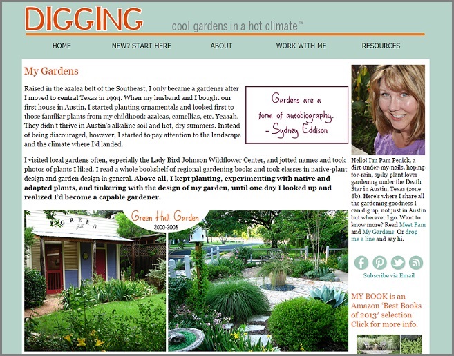
Two years ago I completely redesigned my blog with the help of a web designer. It doesn’t seem that long ago, but lately I’d wanted to clean house again and toss a few metaphorical lace doilies and fringed lampshades that slipped through last time. So I started playing around with a sleeker version of Digging’s old header, a catchier tagline, and improved navigation. With my guru’s help last night (shout-out to David!), we cleaned things up and ta-da! The new look debuts today.
Pop on over to my site from your feed reader, and you’ll notice the photos in the header are gone. I was getting tired of them after two years, and the tighter design doesn’t take up as much real estate, which seems especially important now that people are using smaller devices to visit websites. I rearranged and refreshed the sidebar and added excerpts from my list of current posts, which will, I hope, lead visitors to stay a while and look around. In the footer I added navigation links where before I’d let that space go to waste.
I hope you’ll find it easier than ever to get around at Digging. As for the essentials, they haven’t changed at all. Enjoy your visit, and I hope you’ll come back again soon!
All material © 2006-2014 by Pam Penick for Digging. Unauthorized reproduction prohibited.
Looks great! Thanks for NOT putting in those …. or arrows that you have to click to “see more”! I have no time for that 🙂
I don’t ever want to have to click through to see an entire post either, Rebecca. It makes you think twice about whether you really want to read something, doesn’t it? —Pam
Very sleek. Kudos to you for making things easier on your mobile visitors. Are those drop-down menus at the top new as well? Cheers!
Thanks, Saurs. The drop-down menu was added two years ago in my blog overhaul, but my new look, with the orange line, emphasizes it more. —Pam
It really does! I never noticed them before. Good to know.
Well, I’m especially glad I made these changes then. 🙂 I hope you’ll take a look around and find new posts of interest to you! —Pam
It looks much neater and easier for the smaller devices. I’ve noticed several of my favorite blogs have a text header and I’ve been playing with the idea since my blog will turn three in a few weeks.
I’m seeing extra spaces in your header on my PC screen. I went back to the reader a couple of times and they are still there.
Thank you for letting me know, Shirley. May I ask which browser you use? And if it’s not too much trouble, any chance you could email me a screen shot so I can see what the problem is? —Pam
I’m using Google Chrome and I’ll get a screen shot to you soon.
Weird — I use Google Chrome too. I really appreciate your taking the time to send me a screen shot, Shirley. Hope I can figure out what the problem is soon. —Pam
me too. First thing I notice is a wide blue space, which wastes above the fold real estate.
Chrome on a laptop so it doesn’t matter, I scroll down (past the invisible photos?)
PS the gap is between the orange line and the tabs.
We don’t see it as on your (Pam’s) screenshot.
Problem solved! Clear my cache and Pam and I see the same as her screenshot.
I like the new look. It is clean and uncluttered. I like the new tagline, but I still like the old one too. I removed my picture header earlier this year because it took up more than half of the screen and no longer looked like my garden. I still need to figure out a good and easy way to reduce the size of my photos before I upload them.
Thanks, Michael. The technical side of blogging has plenty of challenges, doesn’t it, at least when you want to customize. It’s worth it though! —Pam
As usual, Pam leads the way! Your knack for design is certainly not limited to your garden spaces. All the shifts are beneficial and you’ve got me realizing I’m way behind the times with my current backwater blogging techniques. Hmmmm…..
Deb, I’ve been reading up on effective website design here and there, and I’ve also noticed that some blogs I follow (Garden Rant and Young House Love, for example) have shrunk their headers and created a much cleaner look — sometimes in order to run banner ads across the top, but usually, I think, to allow more of the content to show on smaller devices. I decided to follow their lead. Still learning! —Pam
I love your tagline, and your new, sleeker look. I don’t think I’ve ever looked at my own blog on my phone. I should do that, and see how it can be improved. Mine has a fussy background, but I like your one-color background, and the buttons on the right-hand side.
My computer-guru hubby says that ideally you have a different format for when your blog is read on a phone’s small screen. I was like, huh? But when I checked Garden Rant (which always seems up-to-date on these things) on my computer screen and then on my phone screen, I understood what he was talking about. That’s a level of complexity I don’t think I can do without professional help, though. —Pam
I like it! Clean and fresh — good description of removing the lace doilies and fringed lampshades. There are some blogs that are so busy and cluttered, it makes it difficult to read. Yours is lovely!
I’m glad you think so, Janet. Thanks! —Pam
Loved the 3 old header photos but have to agree the new format is much more mobile friendly. Thanks for yet another helpful blogging lesson ????
I’m still figuring it out as I go along, Vicki. There’s always more to learn about blogging, isn’t there? —Pam
But I have no idea what caused those question marks.
Change is always good and simpler is good too,
but I did love your header. I would make chages in mine but have no idea how to do it and am frightened of losing the whole thing. I know the one I see on my phone is simple but you can get the web version by scrolling down to the bottom. I would love to do the ‘read more’ but someone will have to show me.
the Read More is easy on blogspot. I’ve just gone thru July posts on both my blogs, to close comments and add Read More jump breaks.
Thanks Diana, I’ll give it a try.Fingers crossed.
Just backup before you tinker, Jenny, and then you’re safe if you do something you don’t like. I think header changes are pretty easy in Blogger. —Pam
Good thought. Do I know how to do that I wonder?
David is always telling me to Google everything I don’t know how to do. And you know, sometimes that works! 😉 —Pam
click Design on your navbar, then layout, header edit and away you go. But keep the image quick to load!
Looks Great Pam! Love the tag line and the fresh crisp look of the site!
Thanks, Laurin! —Pam
Love the new sleek look Pam.
Thanks, Donna! —Pam