

Look for my article in Outdoor Living mag, on sale now
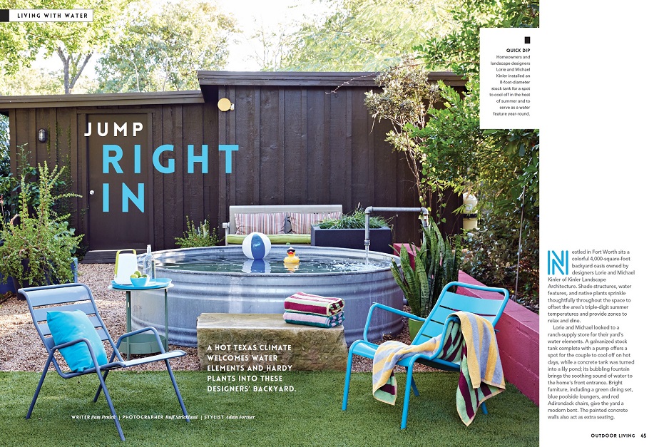
April 12, 2024 Next time you’re in the checkout line at the grocery store or browsing magazines at your favorite newsstand, look for Outdoor Living magazine and my article “Jump Right In,” featuring Lorie and Michael Kinler‘s relaxing Fort Worth garden. Outdoor Living is a special publication by Better Homes ...
I’m writing for Better Homes & Gardens magazine about Texas garden
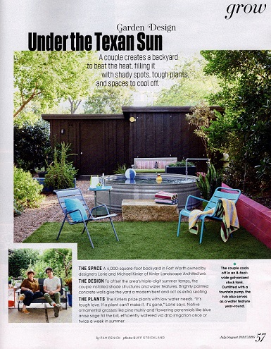
June 19, 2023 Who needs inspiration for making a garden that beats the heat? Um yeah, every Texas gardener — and every other hot-summer gardener too. You’ll find great design moves in Lorie and Michael Kinler’s Fort Worth garden, which I wrote about for Better Homes & Gardens magazine. My ...
I’m writing about the healing power of nature in Wildflower magazine
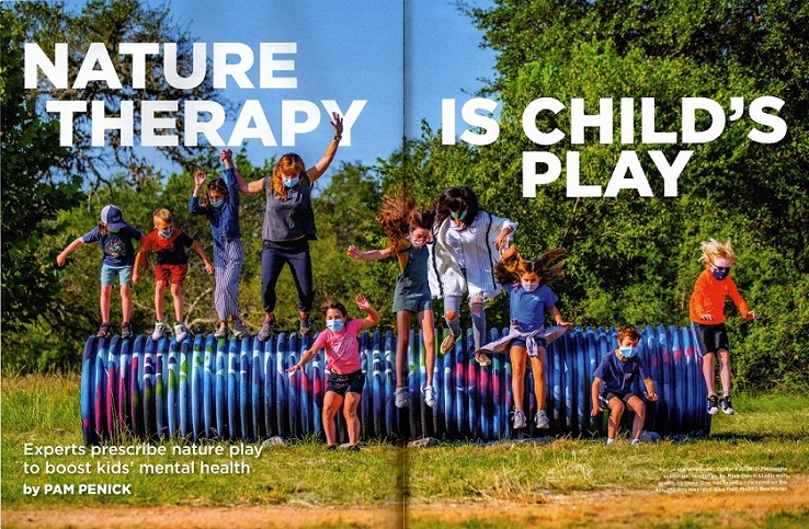
March 24, 2023 The new issue of Wildflower explores the therapeutic power of nature, a timely topic post-pandemic. I’m happy to say I contributed two articles to the issue. The first is “Nature Therapy Is Child’s Play,” which starts on page 24. I looked into studies showing that nature play ...
My fall cleanup tips in Better Homes & Gardens
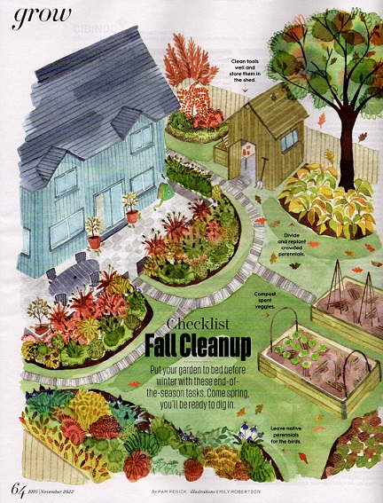
November 03, 2022 My fall garden cleanup tips are in the November issue of Better Homes & Gardens magazine, which should hit newsstands soon. I’m pleased that I was able to represent for warm-winter climates — hint: we keep gardening! — while also giving practical info for shutting-things-down gardeners in ...
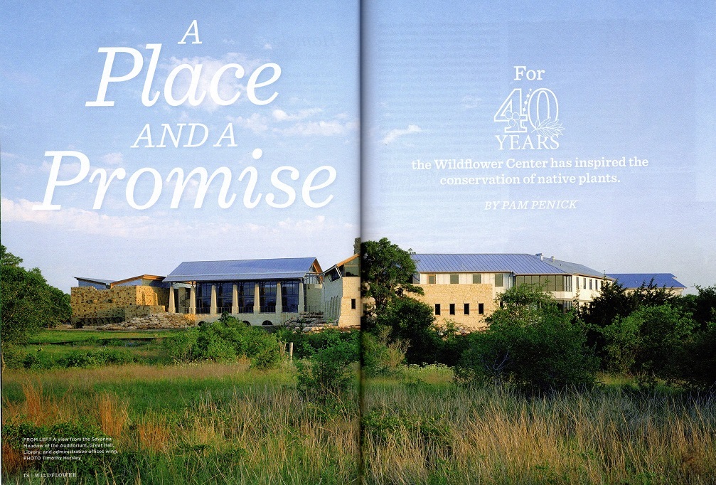
I’m writing for Wildflower on 40th anniversary of Lady Bird Johnson Wildflower Center
August 22, 2022 If you’re a member of the Lady Bird Johnson Wildflower Center in Austin, you’ll soon find the Fall 2022 magazine Wildflower in your mailbox. I hope you’ll take the time to read two articles I wrote, including the cover story celebrating the Wildflower Center’s 40th anniversary and ...
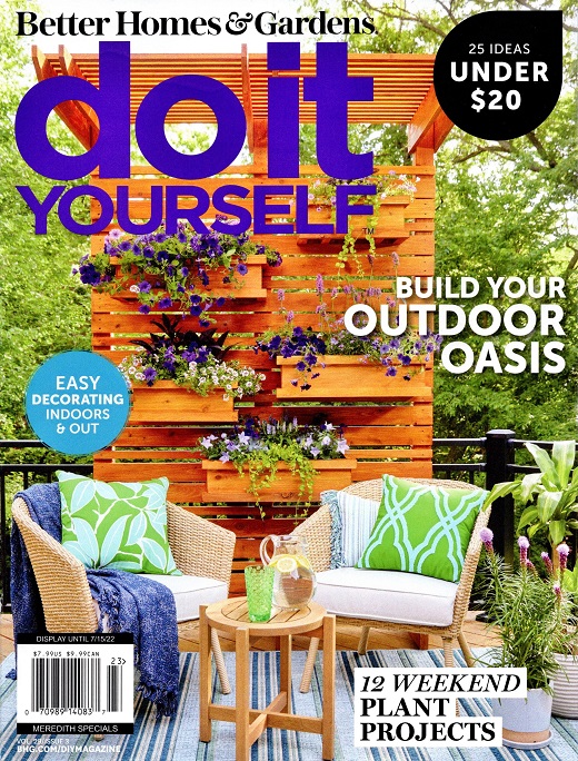
Look for my article in Do It Yourself magazine
April 24, 2022 Are you a DIYer? If so, Better Homes & Gardens Do It Yourself magazine may be the perfect magazine for you. As it happens, I have an article in the Summer 2022 issue, which hits newsstands soon. My article, “Feeding Body & Soul” on page 94, is ...
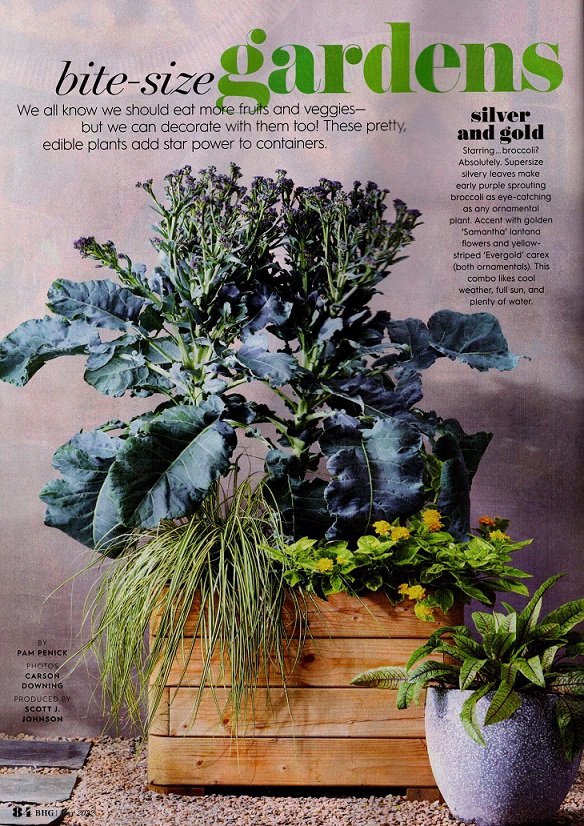
Look for my article, Bite-Size Gardens, in Better Homes & Gardens
April 17, 2022 If you open the current issue of Better Homes & Gardens magazine (May 2022), you’ll find an article I wrote! “Bite-Size Gardens” on page 84 shows beautiful combos of edible plants (with a few ornamentals) sized for container gardening — perfect for patios or small yards. The ...
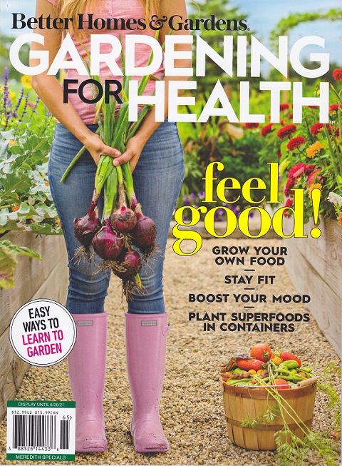
Look for my articles in Gardening for Health magazine
May 05, 2021 When you’re at the newsstand or in the grocery checkout line this month, grab a copy of Better Homes & Gardens Gardening for Health magazine. Inside you’ll find two articles I wrote: a guide to the tools most gardeners need, and a profile about an Austin couple ...
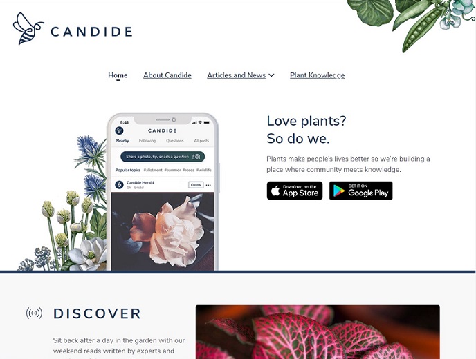
I’m writing for Candide, a new website and app for U.S. gardeners
June 30, 2020 Candide, a website and social sharing app for gardeners, recently launched in the U.S., after first growing its user base in South Africa and the U.K. Now that U.S. gardeners have access, I’m happy to announce that I’m writing articles for the website and sharing more-personal gardening ...
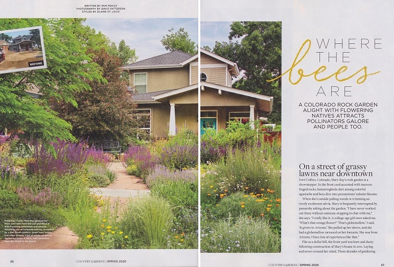
My article about Colorado pollinator garden is in Country Gardens
March 11, 2020 Check out the new issue of Country Gardens, Spring 2020, for my article “Where the Bees Are,” about Mary Ray’s pollinator-magnet xeriscape garden in Fort Collins, Colorado. You’ll enjoy the photos of her floriferous garden and hearing how she turned her flat, dusty front yard into a ...
No Stone Unturned: Read my article in Country Gardens magazine
January 17, 2020 Are you ready for spring, fellow gardeners? It’s that time of year for dreaming over plant catalogs and gardening magazines. Just in time comes the new issue of Country Gardens, which I’m pleased to say includes an article I wrote about a creatively designed garden in Rhode ...
No Rain? No Problem. Read my interview about waterwise gardening in Garden Gate magazine
August 30, 2019 It’s been a hot, dry summer for a lot of us, and our gardens may be looking pretty parched right about now. I grow a waterwise garden here in Austin, but even so I lost a few plants after the rain spigot cut off in mid-July. There’s ...
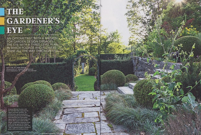
Gardening with eyes and heart: Look for my articles in fall issue of Country Gardens
August 08, 2019 I’m delighted to share that I have two articles in the current issue of Country Gardens (Fall 2019), a terrific magazine packed with design inspiration and the stories of homeowner-gardeners who have vision, enthusiasm, and a love of plants. The Gardener’s Eye: Michael Gordon’s garden in New ...
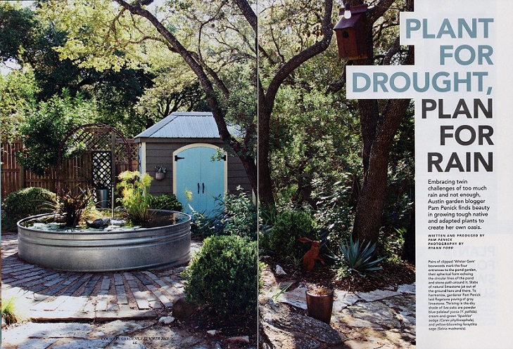
Read about my garden in Country Gardens magazine
May 06, 2019 My garden is featured in a national gardening magazine, and I’m pretty excited about it! Grab the summer 2019 issue of Country Gardens (not just country gardens, y’all), turn to page 66, and you’ll find my article “Plant for Drought, Plan for Rain.” It’s about how I ...
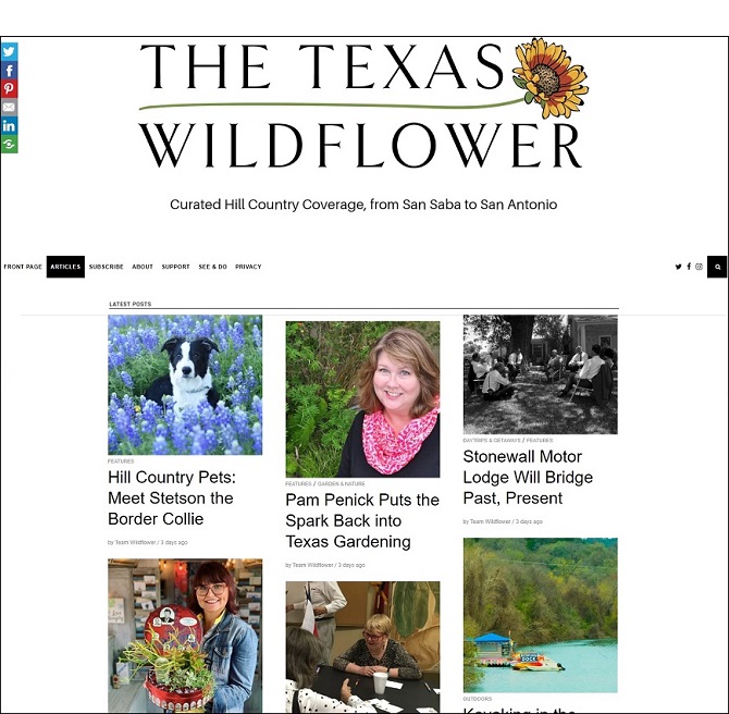
The Texas Wildflower interviews me about Garden Spark design talks
April 04, 2019 Are you into garden design or keen on learning more about it from the experts? Me too! That’s why I started the garden design speaker series Garden Spark. The April issue of e-magazine The Texas Wildflower shines a spotlight on the series and how it got started, ...
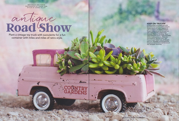
Planting vintage toy trucks: My article in Country Gardens
March 05, 2019 Let’s all ignore winter and keep on truckin’ with spring gardening plans. That might include, if you read my new article in Country Gardens magazine, planting up a vintage toy truck with succulents or cacti. Check it out in the Vol. 28, No. 2 issue, on newsstands ...